UXers, content designers, UI developers and anyone else building digital products
Learn how to design forms that users fly through using research-proven patterns that actually work
Join 100s of designers inside Form Design Mastery and learn how to design (highly complex, supersized) forms – and the processes to win over teammates and stakeholders to put it all into practice.
“Forget Dribbble. Adam’s training is essential for anyone who wants to design great forms. Since putting it into practice our conversion rate has increased and our stakeholders are delighted.”
Esben LorenzenDesign Lead at Pento
You probably know a fair amount about basic form design already
But maybe you’re less confident when designing more complex form flows with intricate interactions.
And even when you are confident in your solution, there’s the problem of getting buy-in:
Stakeholders insist on asking users unnecessary questions
Your product manager wants to copy a competitor’s website
A colleague designs an inaccessible solution and won’t budge
You know these decisions will cause problems for your users.
But you don’t have the evidence, the language or the process to push back effectively.
So you compromise and as a result:
Abandonment rates spike
Completion rates drop
Satisfaction scores suffer
And you’re left frustrated knowing how it could have been so different.
That’s why I made this course.
Why I created this course
I’m Adam, a designer and former frontend developer from London, UK.
My mission is to create digital products that are super easy to use.
I’ve been doing this for 20 years for organisations like Tesco, BBC, Just Eat and more recently, GOV.UK.
I’ve always been obsessed with form design.
Not only because forms are at the center of almost every meaningful interaction, but because they are the cause of so many problems.
In 2017, the Government Digital Service (GDS) found that 78% of government casework was the result of user error caused by poorly designed forms.
The private sector is no better. In fact, it’s usually worse.
So in 2018, I wrote Form Design Patterns for Smashing Magazine. And I’ve run live workshops with up to 80 designers.
Now I don't claim to know it all.
But I have helped 100s of designers, content designers and frontend developers transform their forms UX - and the surrounding product.
In 2014, I redesigned a checkout journey for the world’s leading digital takeaway delivery service and increased orders by 5% (37,000 per week)
In 2016, I redesigned an appointment booking journey for a high-profile GOV.UK service and reduced completion time by 83% (from 6 minutes to 1 minute)
I’ve watched 100s of users fill out forms. I know where they struggle. And I can tell you the same design mistakes happen again and again.
But it’s taken a lot of effort to get to this point:
I’ve spent countless hours designing, prototyping and usability testing to find out what works and what doesn’t
I’ve tried (and failed) a million times to convince colleagues to practice good design, not just make things look nice
I’ve read every form design book I could get my hands on. But usually the practical advice is missing, misleading or just wrong
So I took everything I’ve learned and distilled it into a simple course with everything I wish I had when I first started:
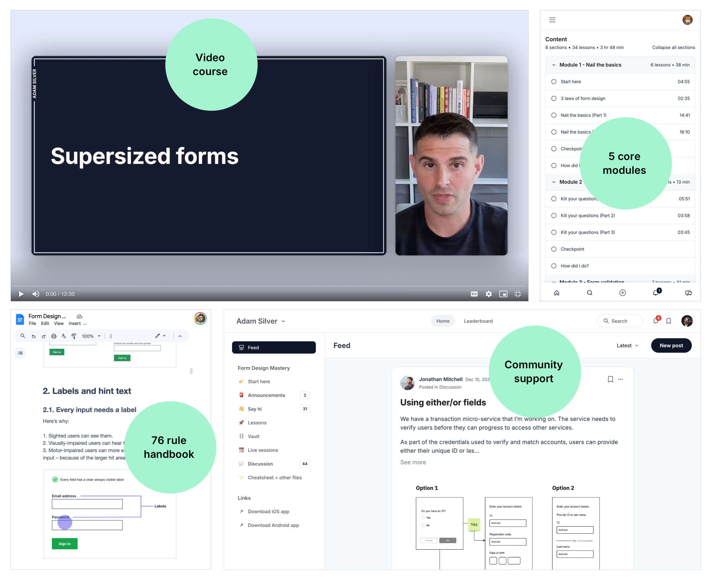
Introducing Form Design Mastery
Form Design Mastery is a 5-module video course that gives you research-proven patterns and practical processes to design (highly complex, supersized) forms that users fly through.
It’s designed specifically for UXers, content designers and UI developers who are fed up with second-guessing their design decisions.
Every lesson gives you specific patterns you can put into practice immediately - patterns that I've tested for over 20 years for organisations like Boots, Just Eat and GOV.UK.
The course is split into 5 modules
No fluff or filler - just 5 modules to get you from form design zero to form design hero in just over 2 hours.
Module 1
Nail the basics
Stop making the most common form design mistakes that ruin conversion. I’ll show you exactly how to redesign them to be simple and accessible - so you can fix problems in your existing forms straight away.
4 lessons, 38 mins
Module 2
Kill your questions
Get a proven process to convince stubborn stakeholders to remove unnecessary questions. Less time arguing. More time improving UX.
3 lessons, 14 mins
Module 3
Form validation
I’ll show you the bad patterns most designers swear by - then the approach I’ve used since 2008 with zero usability issues to report - plus how to write error messages that prevent abandonment.
5 lessons, 32 mins
Module 4
Multi-step form flows
Design complex, multi-step forms with confidence. We’ll audit and holistically redesign a real-life form that works for first-time and repeat users - covering interaction, content and
service design.
3 lessons, 37 mins
Module 5
Supersized forms
Learn the patterns that help users complete forms that take hours, days or even weeks to complete - including all the small but crucial details that keep users on track across multiple sessions.
2 lessons, 18 mins
“I was hesitant to sign up because the course didn’t seem long enough to justify the price. But I was wrong - the course is packed with tips.”
José Pedro del TesoUX/UI designer at Nateevo
Additional deep dives
You’ll also get access to my growing collection of pattern-specific deep dives:
Deep dive 1
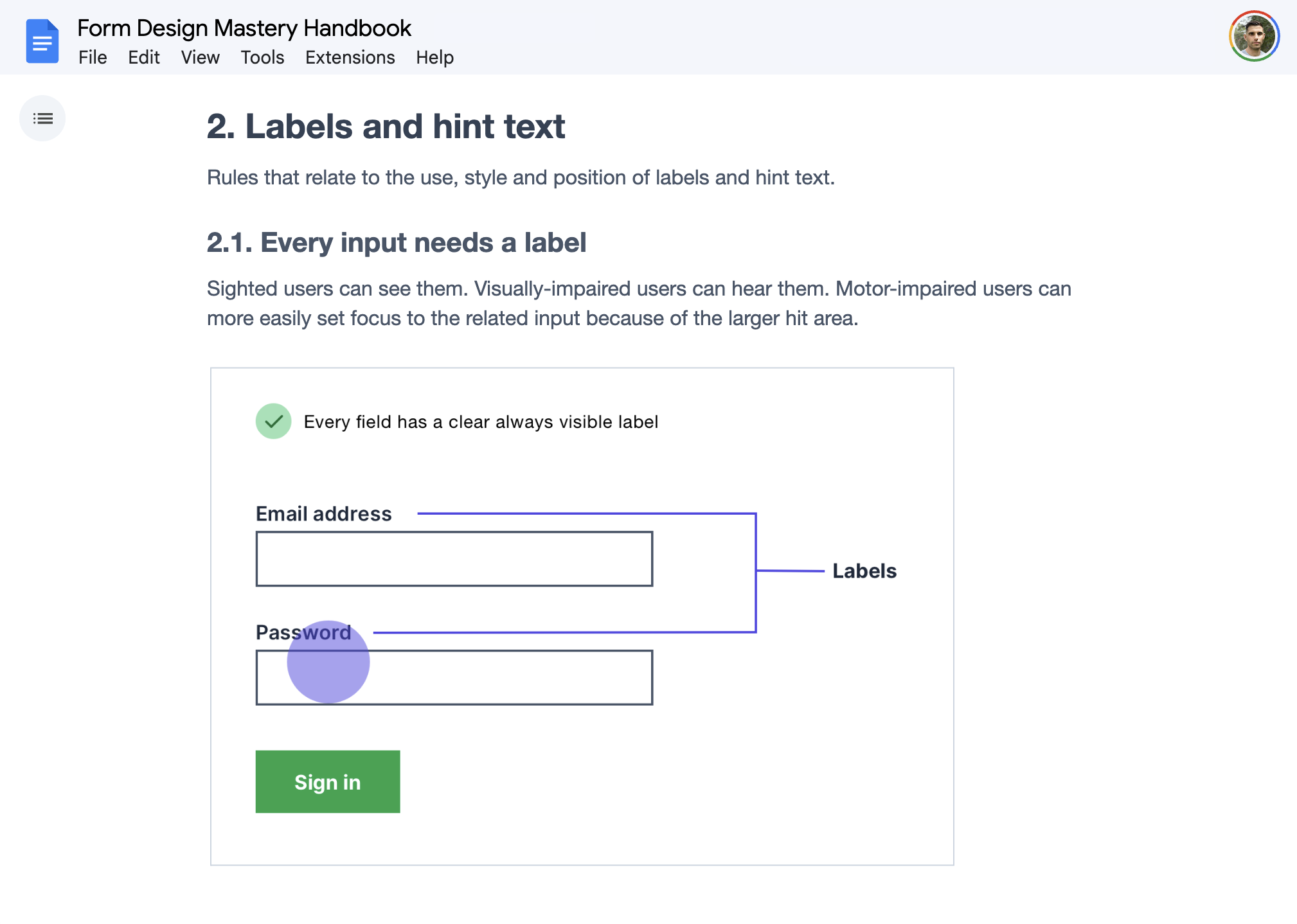
How to write labels
Bad labels are one of the most common causes of abandonment. Follow these 5 rules to write crystal-clear labels that tell users what to do.
3 mins
Deep dive 2
Keeping users orientated within enterprise software
Enterprise users juggling multiple form flows often lose track of where they are. Here’s a simple pattern that keeps them orientated.
3 mins
Deep dive 3
Dates and date pickers
Date interactions are notoriously difficult to design. Here are the 5 patterns you need - including a close-to-perfect accessible date picker.
12 mins
Deep dive 4
Preventing double submission
Users can accidentally submit forms multiple times. Here’s how to prevent that without the downsides of disabling the submit button.
4 mins
Trusted by designers worldwide
Form Design Mastery has been taken by individuals and teams working at companies, governments and educational institutions worldwide.
A few tips from the course
The $300M form design mistake that most designers don’t even realise they’re making. (The fix takes minutes - but the impact on conversion is huge.) (Module 4, Multi-step forms, part 1, 2:05)
The form validation pattern most designers swear by - that actually reduces conversion. (And the simple alternative I’ve used since 2008 with zero usability issues.) (Module 3, When to validate, 1:10)
A glaring UX mistake on Amazon’s registration form - and the simple fix that increases sign-ups. (If Amazon gets this wrong, there’s a decent chance you might too.) (Module 1, Nail the basics, part 2, 3:30)
The Apple design principle you’re probably ignoring in your forms. (You probably know it — but you’re probably not applying it to your forms.) (Module 1, Nail the basics, part 1, 12:34)
How to convince stubborn stakeholders to remove unnecessary questions - even when they’re certain they need them. (This process has ended more design arguments than anything else I’ve used in 20 years.) (Module 2. Kill your questions, part 1)
7 simple rules for writing error messages that prevent abandonment instead of causing it. (Just plug your field labels in - no content design skill needed.) (Module 3, How to write error messages)
How to stop users abandoning on the last step of a multi-step form - right when they’re about to convert. (This trust-building pattern reduces mistakes and increases conversion at the same time.) (Module 4, Multi-step forms, part 3, 5:45)
Why hint text gets completely ignored by users - and the pattern that guarantees users will read it. (Module 4, Multi-step forms, part 2, 9:02)
Why tabs don’t belong in forms. (And the zero-friction alternative that outperforms them.) (Module 4, Multi-step forms, part 1, 1:01)
A form field design rule that most designers either don’t know or flat-out ignore. (Follow it and your complex forms become significantly easier to fill in.) (Module 4, Multi-step forms, part 1, 3:01)
Why placeholder text degrades the usability of your forms - and the accessible alternative that actually helps users. (Module 1, Nail the basics, part 1, 1:35)
Why progress indicators cause more problems than they solve. (And what to show users instead that actually keeps them going.) (Module 4, Multi-step forms, 7:05)
How to present complex questions that have a lot of guidance. (Most designers make this harder than it needs to be and degrade UX in the process.) (Module 1, Nail the basics, part 1, 9:44)
The single-question form design mistake that most designers make - and the easy fix. (Module 4, Multi-step forms, part 1)
Why native radio buttons are a usability problem - and the fix that improves both usability and aesthetics at the same time. (Module 1, Nail the basics, part 1, 13:01)
How to help users pick from a long list of options without getting overwhelmed. (This hybrid pattern combines the best parts of 3 different patterns.) (Module 4, Multi-step forms, part 2, 4:15)
When to hide extra guidance behind a toggle - and when doing so will backfire. (Use these 2 criteria to decide.) (Module 1, Nail the basics, Part 1, 9:51)
Most designers don’t think about error messages getting cut off on mobile. (Here’s the simple enhancement that fixes it.) (Module 3, How to show errors, 4:25)
How to implement hint text so screen reader users actually hear it. (Most implementations get this wrong - here’s the one that works.) (Module 1, Nail the basics, part 1, 4:52)
The interaction pattern that increased revenue by £50M per year. (It’s surprisingly simple - yet most designers overlook it.) (Module 4, Multi-step forms, part 1, 8:00)
And so much more.
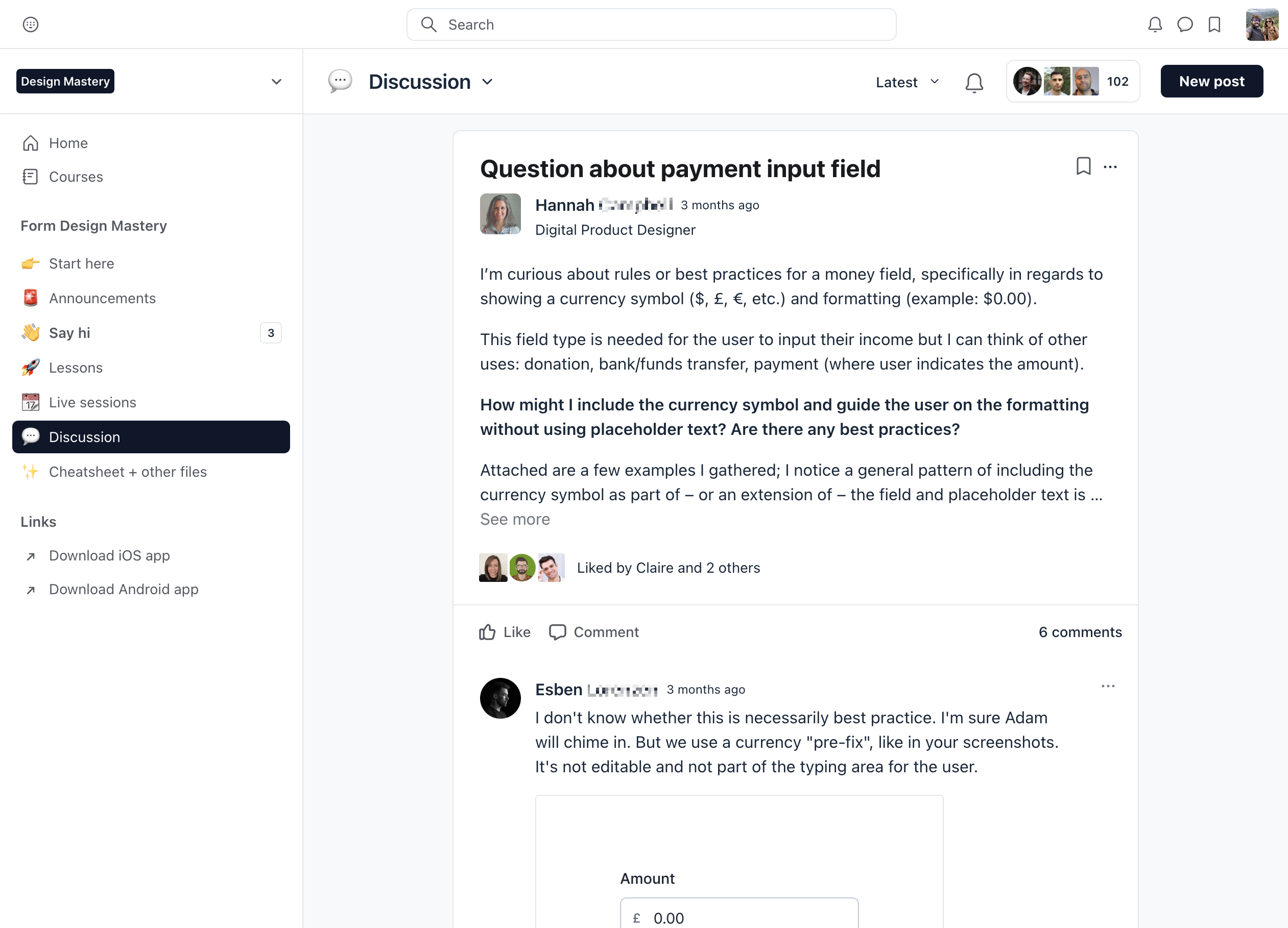
Form Design Mastery Community
You’ll get access to a community of form design obsessives who are happy to give support when you need it.
What former students have said
Before taking the course, I struggled to explain my design decisions. Now when someone questions me, I can clearly communicate every aspect of my approach. The course has made my life as a designer so much easier.
Joe HortonInteraction designer at UK Government
Since taking the course, I’ve received many comments from stakeholders about how much faster I design form flows and how consistent my designs have become. I regularly reference the course and recommend it to every designer I know.
Dan PapeSenior UX designer at Next
I love how this course naturally weaves accessibility and content design into the form design process. Adam makes it clear that accessibility isn’t an afterthought but an integral part of the design itself. I’ll be referencing the resources in my day-to-day work. Highly recommended.
Gretchen MaciolekSenior designer
I’ve consumed countless articles, webinars and courses but none helped me very much - until Adam’s course. His experience is grounded in research, accessibility, and practical, well-thought-out interactions, all shared in a welcoming environment for collaboration. Highly recommended.
Nataliia BieschastnovaSenior UX/UI designer at Kyndryl
The course breaks down real-world examples and backs up design decisions with real data. I work in a space where quantitative data is king, and since making changes to field labels and removing unnecessary steps, we’ve seen an increase in qualified form completions. Highly recommended.
Ryan WeisserSenior product designer
This course is a cheat code for understanding what makes a good form in any scenario. I've learned so much in such a short space of time and I can’t wait to apply it to my client work. I feel empowered and inspired - thank you, Adam! I can’t recommend this course enough to any designer.
Adam KingProduct designer at Forme
Adam’s course is a must for anyone who wants to design and build accessible forms that convert. Even as an experienced designer, the tips and discussions deepened my understanding and gave me techniques to use going forward. The videos are excellent and the live Q&A calls were brilliant!
Sajhd HussainSenior UX designer at John Lewis
Before taking the course, my biggest struggle was choosing the right component for the job. I now feel much more confident in doing that for any user journey. This course will help you design better products and communicate your ideas effectively to BAs, content designers and product owners.
Kirill TitovInteraction Designer at HMRC
Two colleagues recommended Adam’s course, and I’m glad they did. I now see what bad form design practices are and understand what to avoid - as well as what good form design looks like. The community is incredibly valuable for discussing problems with other designers. I'd highly recommend it.
Claire HartUI designer at Next UK
Joining Adam’s course was a bucket-list moment for me as a designer. Following his advice, we’ve seen abandonment decrease, while conversion has increased. I’m in awe of Adam’s knowledge and expertise in form design. The data and insights we’ve gathered — from attending Adam’s course to embedding its lessons into our ways of working — have helped us shape and improve our forms.
Paul BraddockLead designer at Co-op Group
Before taking this course, my biggest struggle was being the single voice amongst 20+ teammates and stakeholders who constantly questioned my suggestions. The tools and techniques I’ve learned have given me enough confidence to stand my ground. As a result, our forms have been simplified in every way - so much so that other areas of the business have reached out to me for help. Thanks, Adam, I’m still getting value from the community to this day.
Paul DouglassUX designer
I'm not exaggerating - I consult Adam’s cheat sheet at least once a day while designing. He's helped me understand that it's unnecessary to reinvent the wheel. If you want good usability, following the basics work. I've also learned how to choose the right navigation pattern to help users fill out complex forms. The Q&A calls were invaluable for solving job-specific design challenges. Considering that most digital products involve forms, this course is extremely valuable.
Paula CayuelaProduct designer
Let’s face it - at the enterprise level, a lot of product design is actually form design. It’s not glamorous work, but it’s extremely important. This course clearly explains the DOs and Don’ts of form design. Adam’s approach is refreshingly clear, and his experience designing for large and diverse user groups makes it easy to trust and adopt his expertise. Since completing the course, we’ve updated our design system and now have a clear framework to make good design decisions.
Andrew BloyceSenior product designer at Tanda
Forms are one of the trickiest parts of UX and I've been searching for solid foundations to build better forms and improve our existing flows. Having followed Adam's newsletter for some time, I decided to take his course - I’m glad I did. Form Design Mastery provides clear foundations and practical tips, explaining the reasoning and impact behind every decision. It’s helped me improve our forms, enhance conversion and guide engineers to make technical improvements that improve accessibility. Totally worth the cost!
Simon VandereeckenProduct designer at Checkout.com
I’ve often had to take the few wins I can get while still shipping forms that were bloated, poorly designed, and hard to use. But this course reinforced what I already knew and taught me so much more. I’ve already used Adam’s process to streamline a form used by my company’s high-value accounts. Even though I‘m not an engineer, the code examples gave me the vocabulary to persuade developers in their practice too. Building great forms is the real work of UX, and no one can teach you more about how to do that than Adam.
Mitch KrpataSenior content designer
As a developer without much design experience, it was hard to justify my design choices to stakeholders, and involving them in the design process was messy and frustrating. After the course, I delivered a new government form where stakeholders wanted seven complex fields. But using techniques from the course, I negotiated that down to just two fields with one of them being optional. This course is not just for people who make forms in the public sector - Adam shows how the techniques work just as well in the private sector.
Pandu SupriyonoWeb Developer
This course has transformed the way I design. My favorite parts were learning how to remove unnecessary questions and the eye-opening details on form validation. The videos are well-edited - every minute is packed with valuable insights. I also appreciate the community, where Adam and other designers are quick to respond to questions and give feedback. Since completing the course, I’ve realised just how poorly designed many forms are - and I can’t help but think how much better the web would be if more people took this course.
Damian OczkiProduct designer at IG Group
Everyone working on digital products should take this course. We need more proponents of the kind of “boring” but wickedly effective design that Adam advocates. I took the course to argue more effectively for this and I can confidently say I certainly added to the arguments in my toolbox. Adam’s examples are clear, hard-hitting and full of helpful advice, including code snippets explained at a level every designer can understand. Even though I was a convert already, the course definitely helped address some of my less-than-stellar practice and regain a commitment to simple and inclusive design at every level of detail.
Marcos VillasenorLead UX designer at CI&T
Get access today
The patterns inside this course are proven to increase conversion and reduce abandonment, something your stakeholders and clients will love.
It’s the kind of result that builds your credibility and their trust in you.
And a couple of afternoons wasted asking AI for form design help - only to get confidently bad advice - can easily cost you more than this course.
Click the button below to get instant access to all 5 modules, the deep dives, the community and all the bonuses.
“The coaching call was incredibly helpful, Adam offered many insights about our form flows and shared many ways to solve the problems we were facing.”
Jay PatelProduct Designer at GoodUp
You’ll also get these bonuses
Bonus 1: Form Design Mastery Handbook
A 67-page hand book containing 82 rules from the course - so you don’t have to take notes.
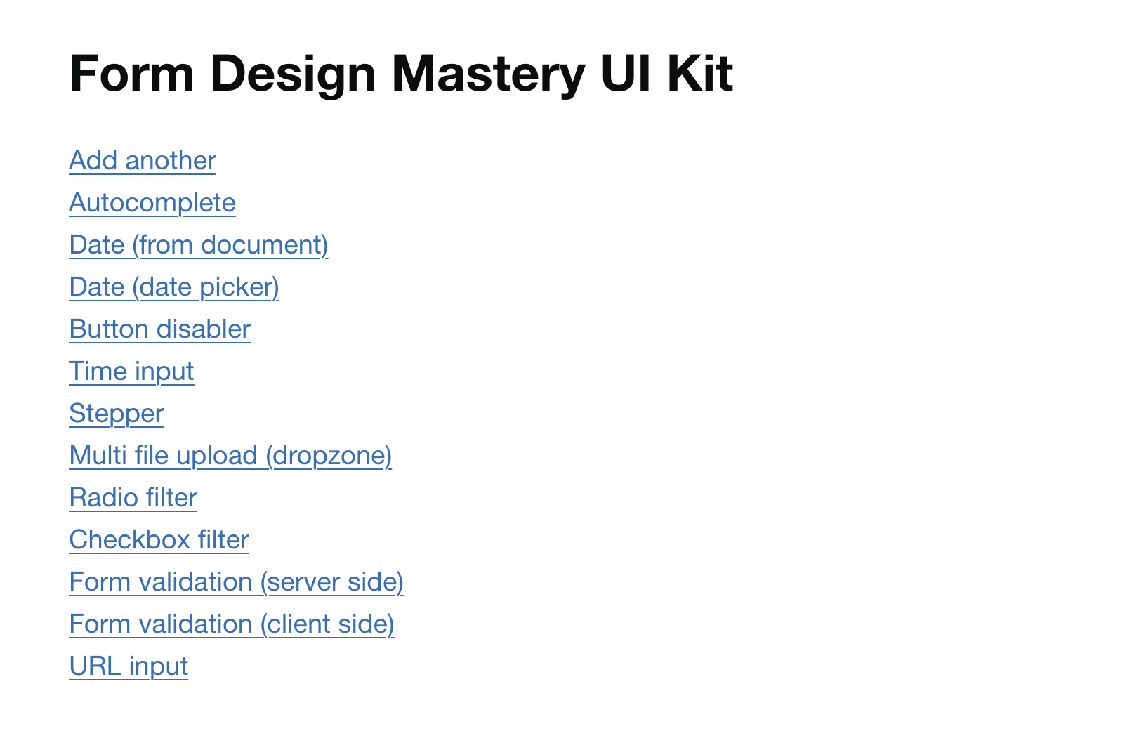
Bonus 2: Form Design Mastery UI Kit
Access my personal collection of simple, accessible and production-ready form components and patterns.
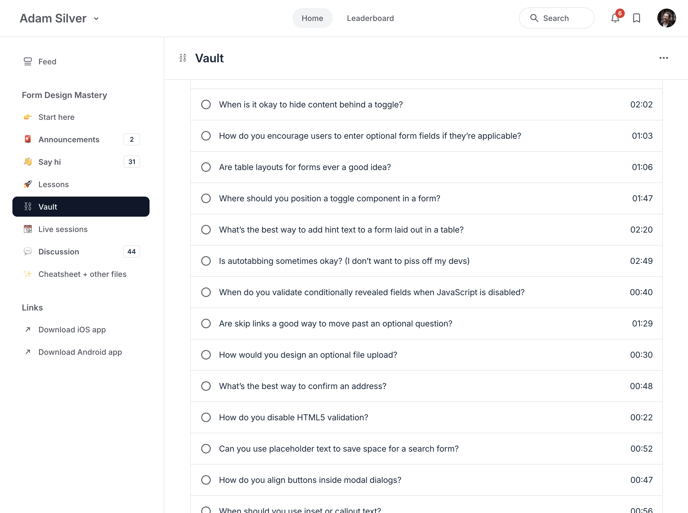
Bonus 3: Form Design Mastery vault (49 videos)
Focused videos of students asking me questions and getting feedback on their real life forms such as the UK’s largest car insurance provider.
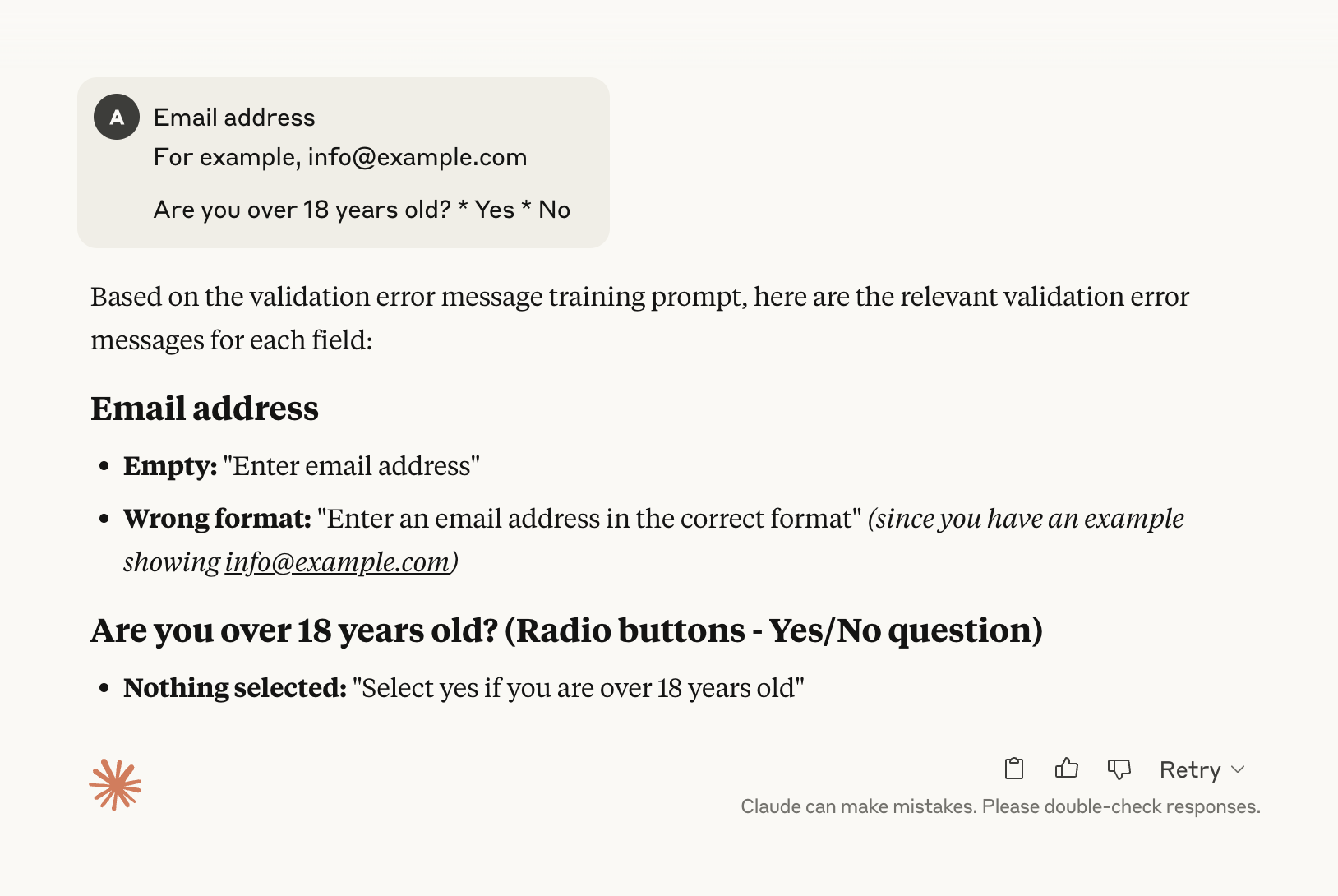
Bonus 4: Form Design Mastery AI error message generator
Convert labels into a comprehensive list of crystal-clear error messages in seconds.
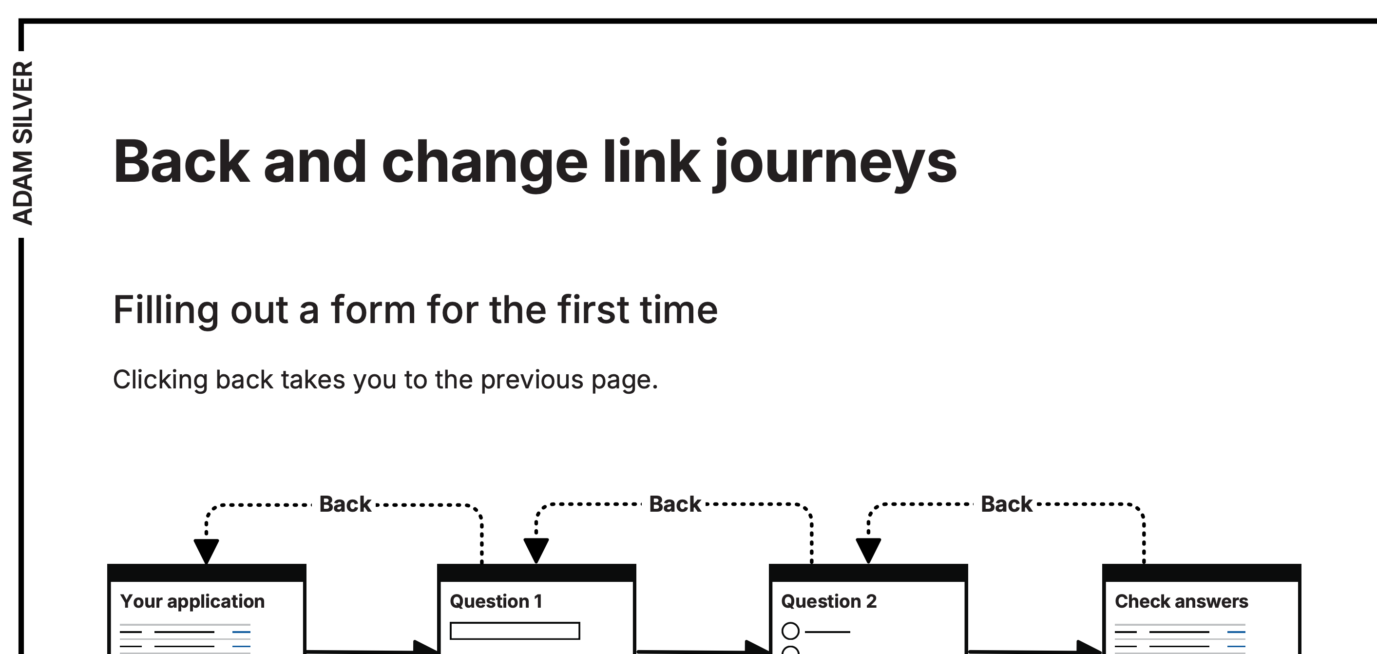
Bonus 5: Back link flow diagram
One-page flow diagram to show how back and change links should work in complex, multi-step forms.
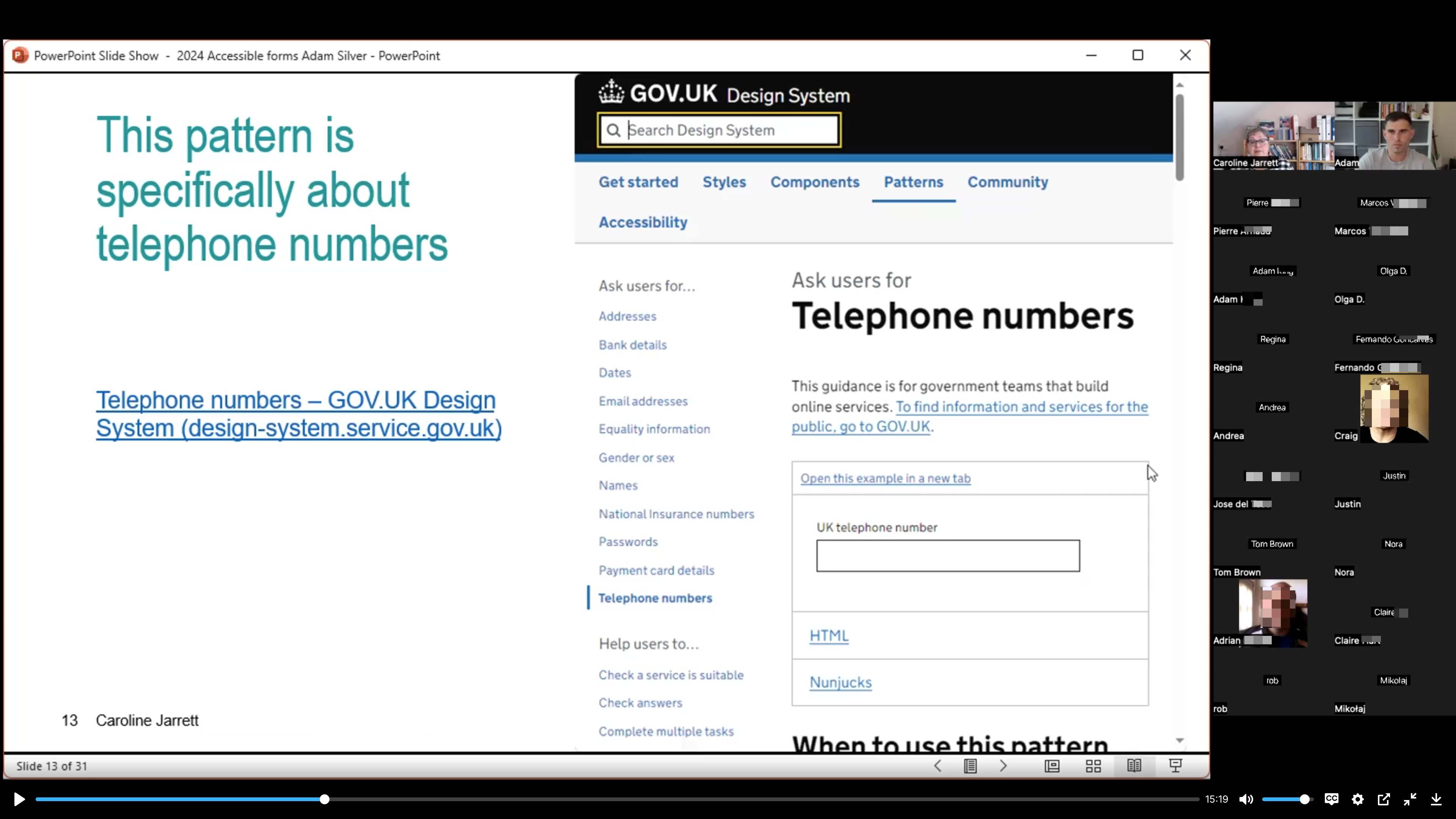
Bonus 6: How to ask for a phone number (1 hour recording)
Get access to forms expert, Caroline Jarrett’s webinar walking through the best way to ask for a phone number (it’s 10x harder than it sounds).
Bonus 7: An alternative approach to designing forms (video + template)
No code, no Figma - just a proven, lightning-fast, collaborative technique that I use daily.
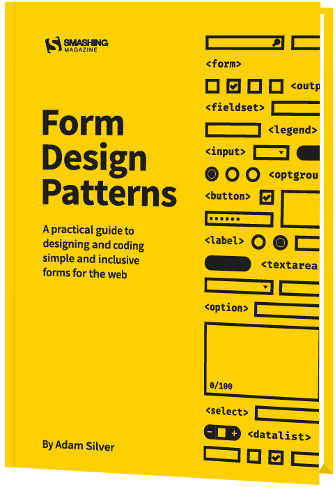
Bonus 8: Form Design Patterns (published by Smashing Magazine)
A copy of my 384-page ebook which contains holistic redesigns of 10 real-world form flows with code snippets and explanations for each and every component.
(Note: As I wrote the book in 2018, some of the content is out of date. So please watch the videos before you read the book.)
Enrol your team and get everyone working from the same playbook
Spend less time debating best practices. Get everyone on the same page by using the same evidence-based design patterns.
I’m currently offering discounts of up to 25% for four or more people and a free live call for the group.
“Enrolling the Multiverse UCD team on Form Design Mastery has transfomed how we design user interfaces. The live calls were invaluable - not just Adam’s critique, but for making sure we prioritise practical, research-backed learnings over trends.”
Simon LindPrinciple Designer at Multiverse
FAQs
What’s the refund policy?
I don’t offer a money-back guarantee. Form Design Mastery is a great course and I’ve described it accurately on this page.